Blog
Create a Logo: Why Choose Warm Colors?
When creating your logo, after analyzing your brand, you will need to think about the different visual components. Among these components, there is the color palette. The right shades can help you convey a message and show off your personality. What about warm colors? Let's take a closer look at why you should choose a warm color as the main color for your logo.
What is a warm color?
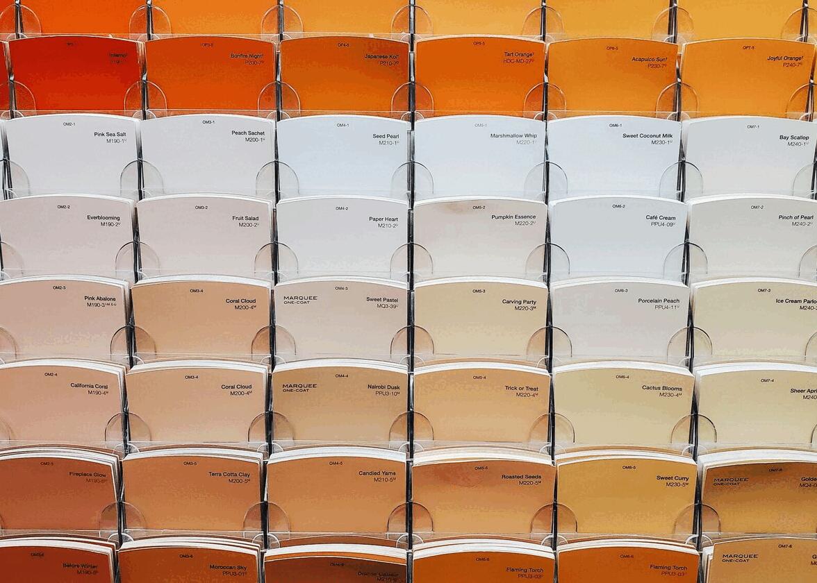
Let's start at the beginning: what exactly is a warm color? Unfortunately, it's not a type of color that's a source of heat, the science isn't there yet. More seriously, a warm color is a color associated with heat and fire. So, it's no surprise that we say that red, orange, and yellow are warm colors.
But what about pink, purple, and brown? Are these colors considered warm colors? In these cases, it's a bit more complicated. Most of the time, pink can be considered a warm color, while purple is associated with cool colors. On the other hand, brown and grey are considered more neutral colors.
What are the benefits of using warm colors in my logo?
So, what are the benefits of using a warm color when creating my logo? How are they different from cool colors? In our opinion, there are several arguments in favor of warm colors, let us introduce you to some of them.
They attract attention
One of the main advantages of warm colors is the fact that they attract attention more easily than cool colors. Our eye notices these colors more easily because they are also associated with different hazards. Therefore, if you've just started a business and want it to get noticed, consider using a warm color as the main color for your logo.
They are dynamic
In the same vein, warm colors are also considered to be more dynamic. When we think of a cool color, we feel more serene and calm. Since warm colors are their opposite, they seem full of energy. So, it's something to consider if you desire a more energetic brand image.
They are associated with food
Among the most well-known restaurant logos, a large majority of them use red, yellow, or orange in their color scheme. As examples, we can name KFC, Burger King, and Subway. The reason behind this is that warm colors are often associated with food and could make you hungry. In addition, many popular fruits and vegetables are naturally red, yellow, and orange.
They are associated with love and passion
Finally, warm colors can be used to represent several more abstract things and ideas, such as love and passion. Red is an emotionally charged colour and is the most prominent shade in company logos after blue. It may also be associated with heat, anger, danger, and blood.
A few tips for using a warm color effectively
Now that you understand the benefits of using a warm color, how can you make sure you use them effectively when designing your logo? It doesn't matter if you prefer red, orange, or yellow, the first step is to ask yourself what you want people to feel when they first see your logo.
Then, depending on the adjectives you have in mind, to come up with your color palette, you need to choose a secondary color. If you want to focus on energy and dynamism, you could opt for another warm colour or black. You can also make an impact by using a complementary color. If, on the other hand, you want to temper the effect, you could choose white or a cool color.
Regardless of your choice, we strongly recommend that you use no more than three different colors for your logo. Remember that the more colors there are, the more likely you are to have something with a chaotic or sloppy look.
Four Examples of Well-Known Brand Logos Using Warm Colors
If you're looking for inspiration, we've found four well-known companies that use warm colors for their logo and branding. Their color scheme and composition can definitely give you some ideas for your logo.
McDonald's

When it comes to restaurant brands, McDonald's remains one of the most well-known in the world. Even their combination of red and yellow is easily recognized, they are also common colors in the food field.
Coca-Cola

Famous brands include Coca-Cola. Their signature logo hasn't had any major changes over the years, and red remains an important color for the company.
Mastercard

There aren't many companies that have chosen to use the three warm colors, but Mastercard is a good example. On the other hand, color gradients like this one have been one of the most popular logo trends in recent years.
RedBull

As mentioned above, warm colors are associated with energy. So, it's only fitting that a company like RedBull has chosen red and yellow for its logo. There is a sun and two bulls in motion. The message is very clear.
In conclusion, there are several benefits to choosing warm colors when creating your logo. In addition to attracting attention, red, orange, and yellow can help you show off your dynamic or energetic side. But which warm color best fits your corporate values? For this, feel free to consult our page on the meaning of colors.
More tips and tricks on the blog

